BRANDING
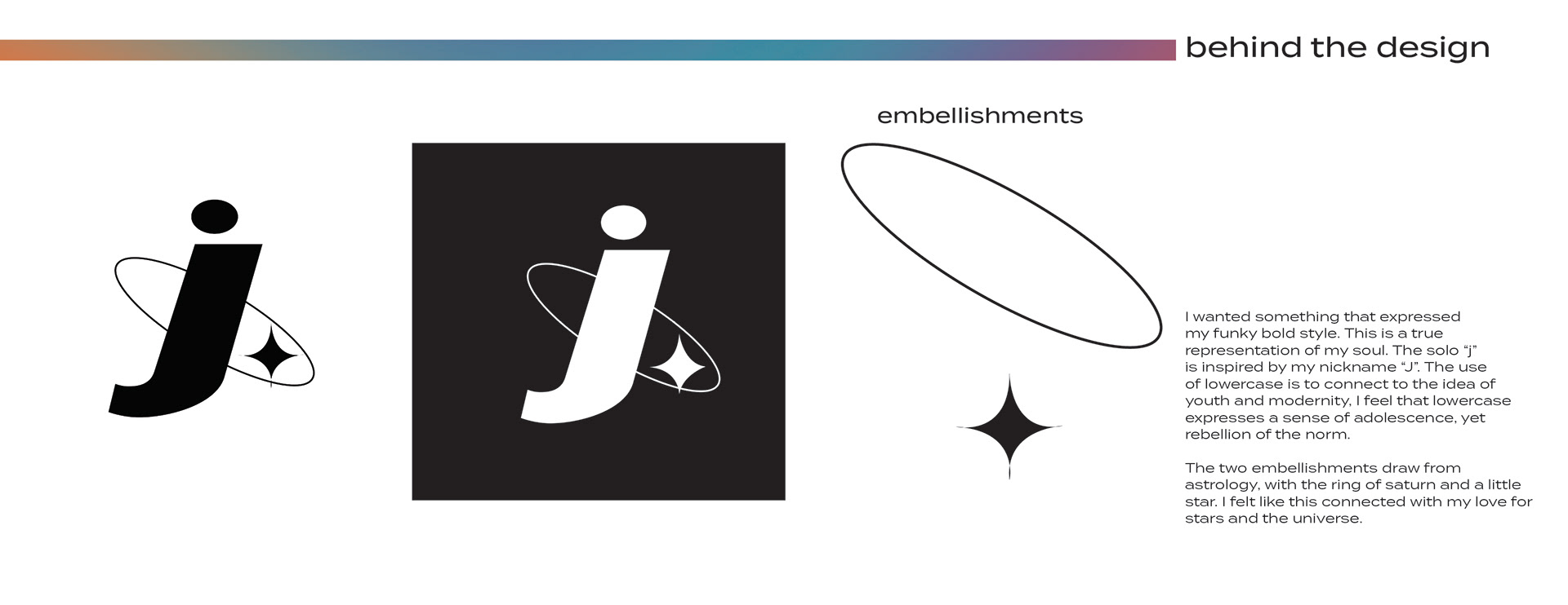
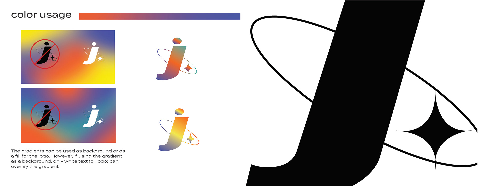
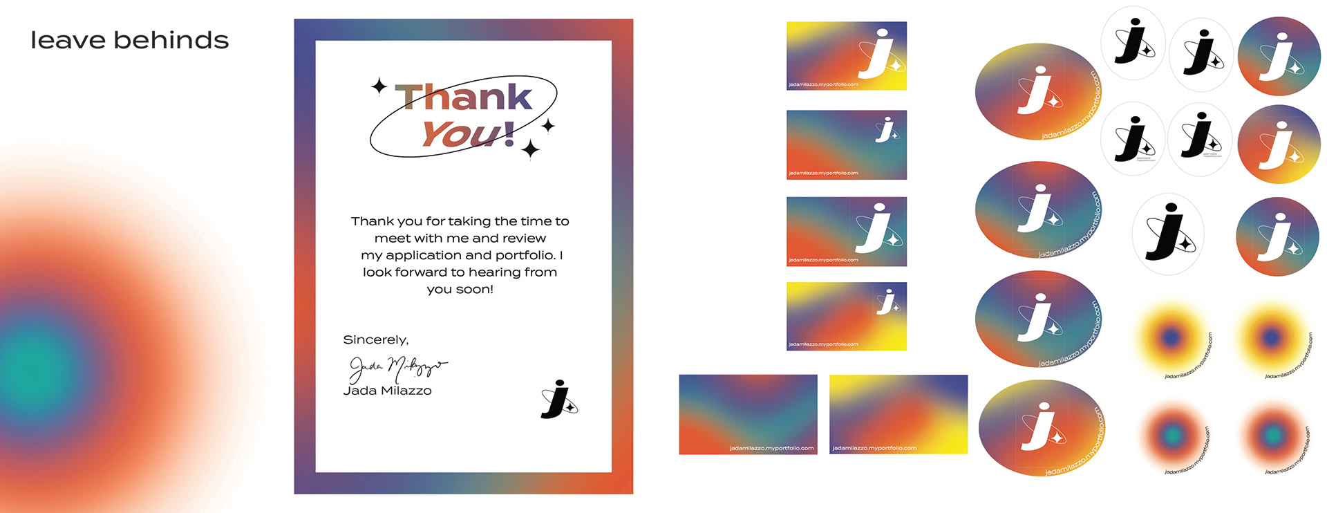
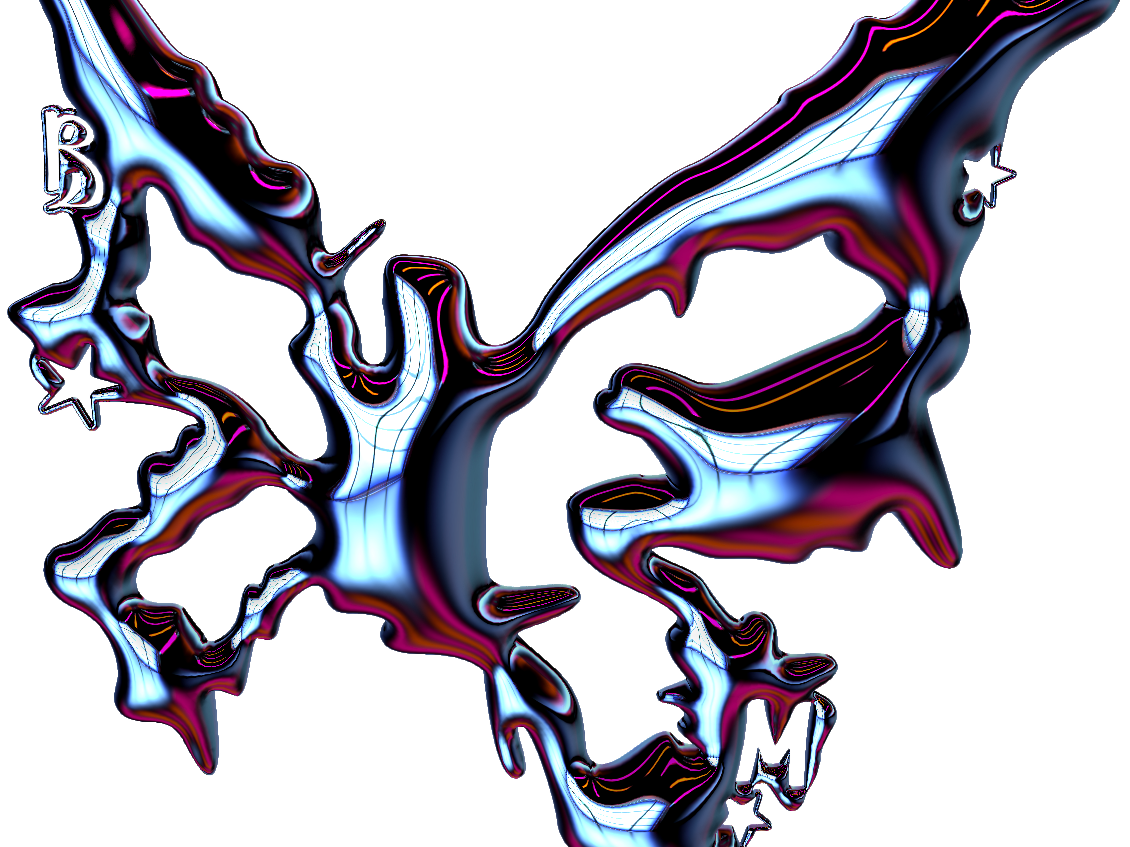
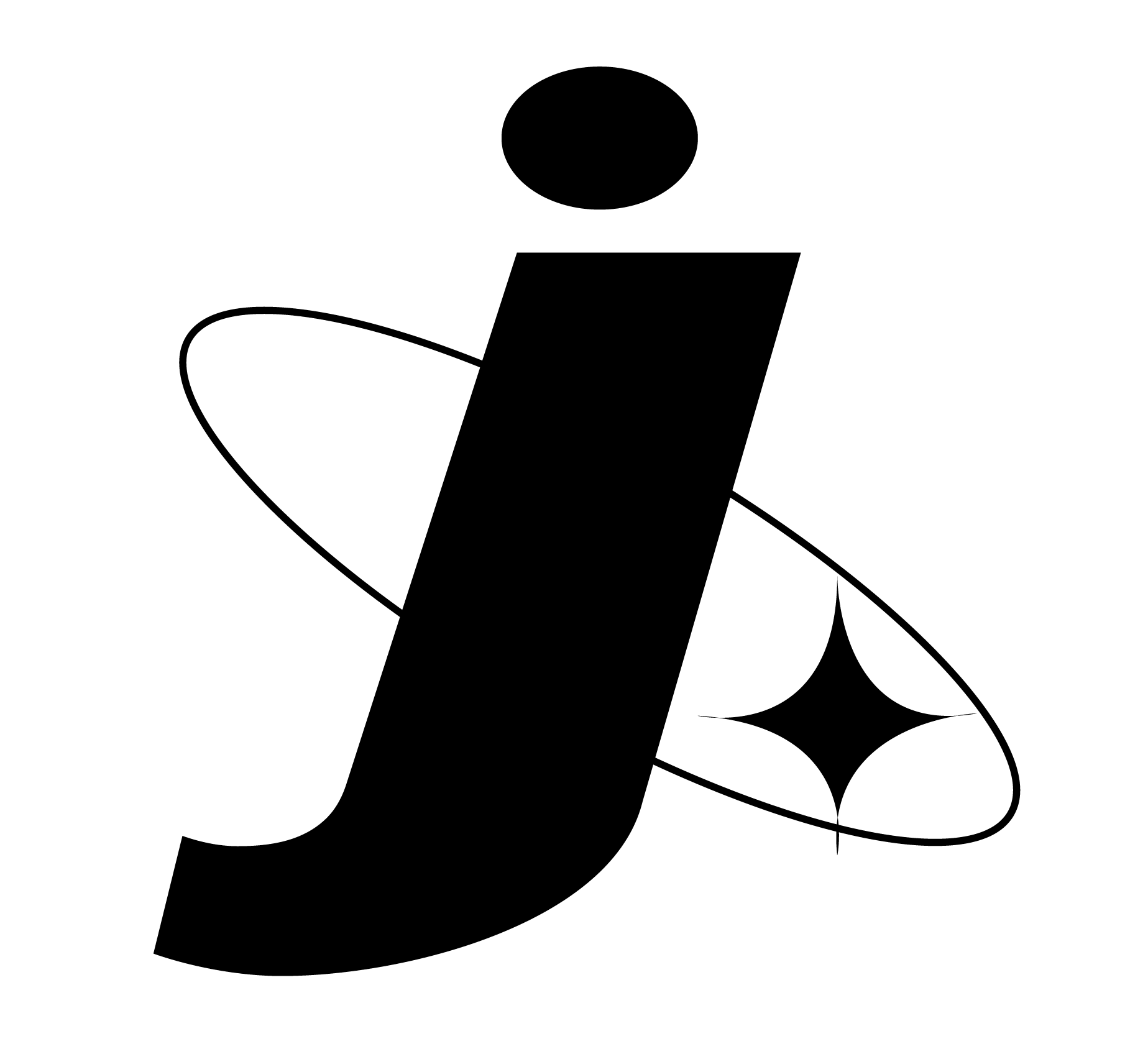
I wanted something that expressed my funky bold style. This is a true representation of my soul. The solo “j” is inspired by my nickname “J”. The use of lowercase is to connect to the idea of youth and modernity, I feel that lowercase expresses a sense of adolescence, yet rebellion of the norm.
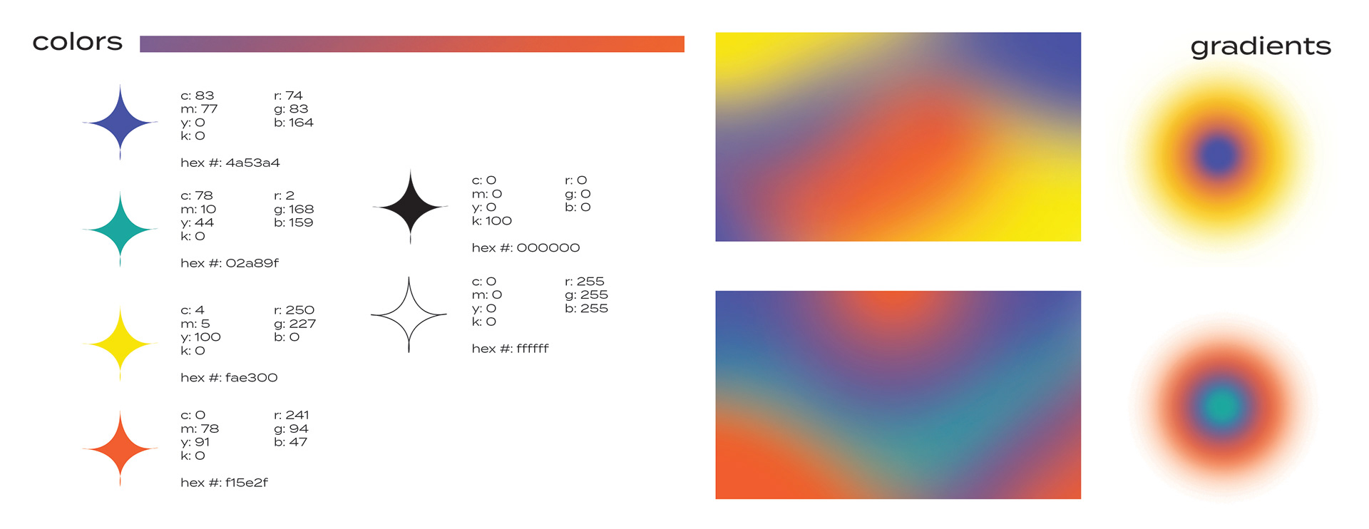
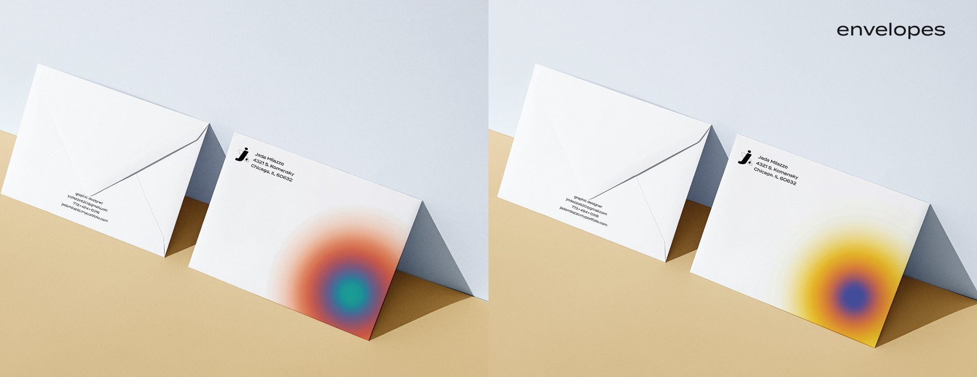
The two embellishments draw from astrology, with the ring of saturn and a little star. I felt like this connected with my love for stars and the universe. The color palette draws from the idea of a personal aura. An aura is the atmosphere and energy that surrounds a person, relating to their identity.
Yellow: sunny, bright, and confident
Orange: creative, action-oriented, and positive
Purple: intuitive and empathetic
Turquoise: insightful, compassionate
All of these qualities are what make me a great designer; allowing me to feel, understand, and empathize with the client, then turn around and take action to develop new ideas.